Custom MATLAB functions
MATLAB has been my scripting language of choice for many years now. During work and play I've found myself building tools that other people
find useful and so I have posted them to the "github for Matlab" users,
Matlabcentral.
I'm really proud of my
ranking as one of the top 2% of matlabcentral
contributors averaging over 300 downloads every month. On
this page I'll talk about some of these functions.
This was one of the first functions I uploaded back in 2010 and it is my personal favorite. Matlab's native histogram function breaks the range of your data into 10 ugly bins by default. It can require a lot of manual tweaking to make the figure visually appealing. I made the nhist function to automate everything in order to compare the eye movement statistics of lots of subjects. It automatically chooses bins and axis bounds to be appropriate for the data and creates an appealing graph. It can also compare multiple sets of data on the same axis. Here is the direct link Histogram in Matlab.
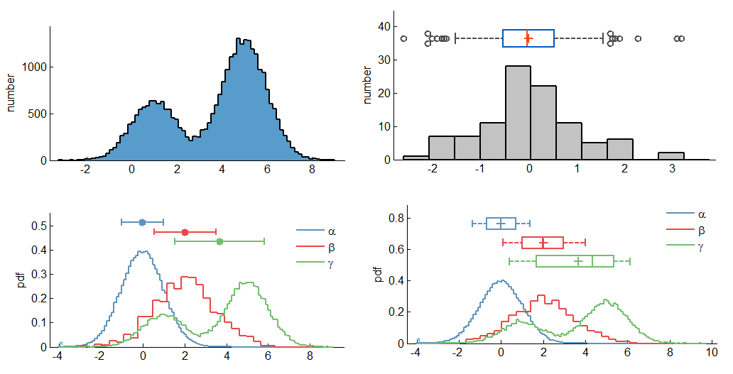
There are a few awesome features it has that help you compare data effectively.
The 'optimal' bin size that is chosen is actually a theoretical measure from "Scott's choice" where 'h' is the bin width, sigma is the standard deviation and 'n' is the number of data points in the set. The axis bounds are chosen by my own simple algorithm of setting it to be 4 times the standard deviation away from the mean (or the minimum of the data set). You can change this number from 4 to any you like, or set hard axis bounds.
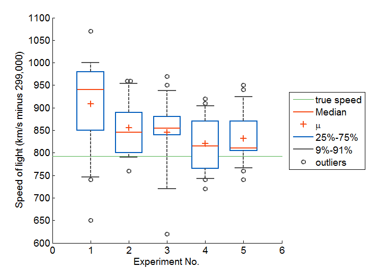
While making this file I created functions to draw make nice boxplots and draw nice errorbars (see below).
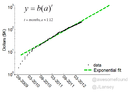
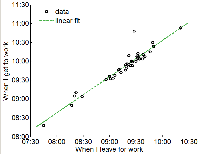
So much natural data can be explained by power laws or exponential theories. Finding a nicely fitting model can teach you a lot about the underlying network or phenomenon that produced the data. I wrote this function for work but I've used it to chart the growth of the awesome foundation, see how long it takes for me to get to work (blog link) and used an old version for my Internet search result probabilities research.
Here is the link to the function: Power Law, Exponential and Logarithmic fit.
I don't express it that often, but I am pretty big map nerd. I wrote this function to compute the Mercator projection for work and then used it to mine Google for biking times around Boston. It also does the inverse Mercator projection.
Here is the link to the function: Mercator projection in Matlab.
Create Healthy Looking Error Bars
By default MATLAB plots a spindly blue wisp of an error bar instead of what you
might typically find in a publication. In my lab people were photoshopping their
errorbars to look prettier (not to change the results :) so I wrote a program
that plots nice error bars as the default. My function also automatically places
errorbars on group bar plots in addition to some other features.
Here is the link to the function: Errobars in Matlab.
Making histograms beautiful
This was one of the first functions I uploaded back in 2010 and it is my personal favorite. Matlab's native histogram function breaks the range of your data into 10 ugly bins by default. It can require a lot of manual tweaking to make the figure visually appealing. I made the nhist function to automate everything in order to compare the eye movement statistics of lots of subjects. It automatically chooses bins and axis bounds to be appropriate for the data and creates an appealing graph. It can also compare multiple sets of data on the same axis. Here is the direct link Histogram in Matlab.
There are a few awesome features it has that help you compare data effectively.
- The default behavior plots the discrete probability density of data set together by normalizing the area under the histogram to one
- To make things comparable when there are different bin sizes, the bin sizes are automatically set to be multiples of each other
- Integer data is detected and integer bins used
- The mean+standard deviation or a boxplot can be plotted above each distribution
- It outputs statistics as strings which I then included into an automatically generated LaTex file.
The 'optimal' bin size that is chosen is actually a theoretical measure from "Scott's choice" where 'h' is the bin width, sigma is the standard deviation and 'n' is the number of data points in the set. The axis bounds are chosen by my own simple algorithm of setting it to be 4 times the standard deviation away from the mean (or the minimum of the data set). You can change this number from 4 to any you like, or set hard axis bounds.
While making this file I created functions to draw make nice boxplots and draw nice errorbars (see below).
Power Law, Exponential and Logarithmic Fit:
So much natural data can be explained by power laws or exponential theories. Finding a nicely fitting model can teach you a lot about the underlying network or phenomenon that produced the data. I wrote this function for work but I've used it to chart the growth of the awesome foundation, see how long it takes for me to get to work (blog link) and used an old version for my Internet search result probabilities research.
Here is the link to the function: Power Law, Exponential and Logarithmic fit.
Mercator projection
I don't express it that often, but I am pretty big map nerd. I wrote this function to compute the Mercator projection for work and then used it to mine Google for biking times around Boston. It also does the inverse Mercator projection.
Here is the link to the function: Mercator projection in Matlab.
Create Healthy Looking Error Bars
By default MATLAB plots a spindly blue wisp of an error bar instead of what you
might typically find in a publication. In my lab people were photoshopping their
errorbars to look prettier (not to change the results :) so I wrote a program
that plots nice error bars as the default. My function also automatically places
errorbars on group bar plots in addition to some other features.Here is the link to the function: Errobars in Matlab.