Better off biking or taking the T?
I made a this video to demonstrate the time savings of
getting around Boston by bicycle. This page is going to
discuss everything that went into making it. To read some
general commentary about the implications shoot over to the
Loud Bicycle Blog.
The first step is to collect the data from Google Maps. You should of course use the Google Maps API. Get yourself a key and use it with every query you build.
It is possible to specify a lot of detail in a a Google Maps URL, lets take a look at this example: The final url will be a concatenation of all these lines together. Replace the text in
the brackets as instructed
Putting these all together you get this link (note: don't forget to add your key). Loading that page will give you a lot of html to play with. I was interested in the shortest time to get to the location so I did some text parsing. Search for each occurrence of:
I looked at all the end times, 1:26pm in this example, and picked the end time that was closest to the start time for each search.
You follow pretty much the same structure but you will add these bits to the URL:
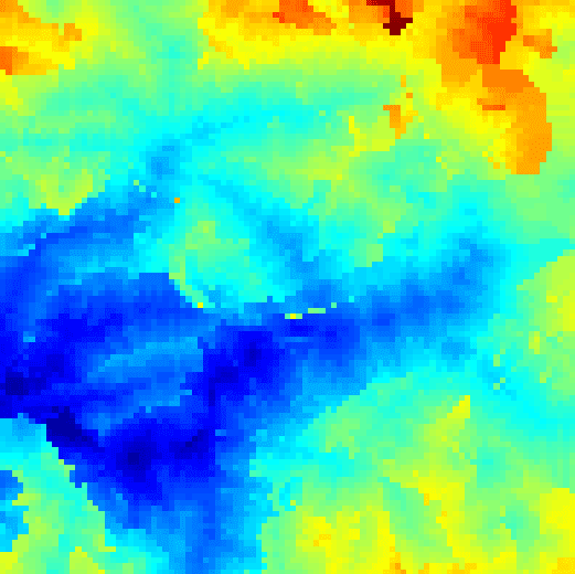
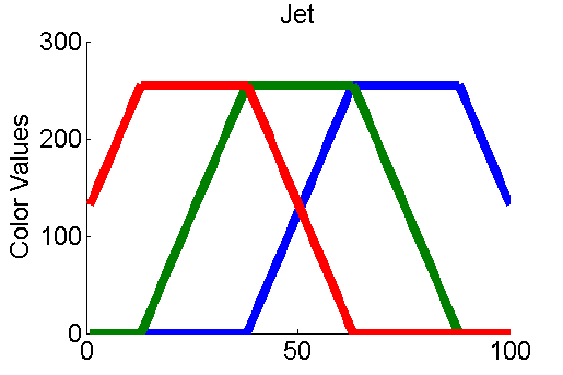
If we just plot the raw data then we get a pretty OK looking pixelated graph. On the left is Matlab's default colormap. Although you can see a pretty decent amount of detail, the order of all the colors isn't intuitive to most people and the blues and reds really stand out much more than they should based on the data alone.

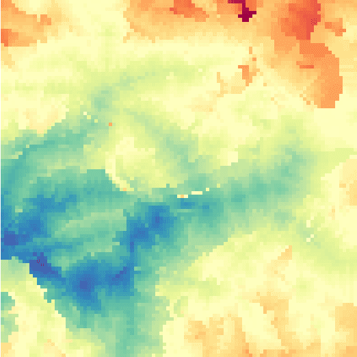
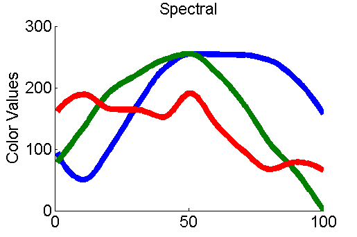
 The graph on the right uses a colormap from http://colorbrewer2.org/. Using this colormap no particular color stands out colorblind people can get more information out of the graph too. I used the 'spectral' option set to 11 colors, and interpolated in between. Comparing the color value changes of the default (jet) and 'spectral' colormaps you can see immediately that a whole lot more thought went into the colorbrewer colormap.

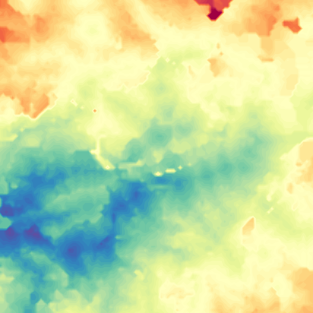
 The last step to making a pretty plot is to use the contour function which smooths over all the pixels. You are going to want to specify the range so that you can compare different plots using the same colorbar scale.

Next you need a nice grayscale map that has enough white-space for you to insert color. Stamen Design produced a series of maps perfect for this funded by the Knight Foundation. Here it is below:
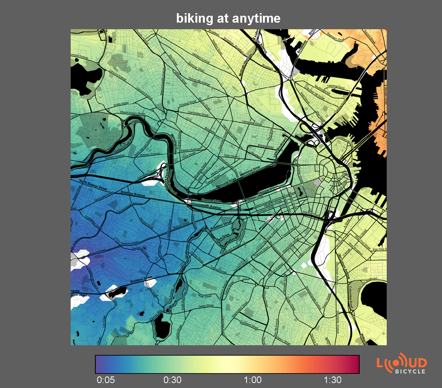
Merge the Toner map with the contour plotted heatmap and you get the final product shown below:
Feel free to share these images or email me with questions.
The first step is to collect the data from Google Maps. You should of course use the Google Maps API. Get yourself a key and use it with every query you build.
Generating a Google maps URL
It is possible to specify a lot of detail in a a Google Maps URL, lets take a look at this example: The final url will be a concatenation of all these lines together. Replace the text in
- http://maps.google.com/maps?f=d&source=s_d&saddr=<the start address, for example the coordinates: 42.336032+-71.150873>
- daddr=<the end address, for example the coordinates: 42.356032+-71.139285>
- &hl=en&mra=ltm&dirflg=r&ttype=dep&
- date=<the date you will leave, for example: 02%2F07%2F11&>
- time=<the time you will leave, for example: 13:00>
- &noexp=0&noal=0&sort=def&sll=42.337695,
-71.100305&sspn=0.045427,0.076561&ie=UTF8&z=13&start=0& - key=<put your API key here>
Putting these all together you get this link (note: don't forget to add your key). Loading that page will give you a lot of html to play with. I was interested in the shortest time to get to the location so I did some text parsing. Search for each occurrence of:
class="altroute-info">
and find: 1:01pm - 1:26pm
To get biking times:
You follow pretty much the same structure but you will add these bits to the URL:
- &hl=en&mra=ls&dirflg=b&sll=42.339894,-71.096134&sspn=0.09085,0.153122&ie=UTF8&ll=42.34535,-71.105061&spn=0.090842,0.153122&z=13&
- lci=bike
Similar parsing methods will get you the travel times.
Building a pretty heatmap
If we just plot the raw data then we get a pretty OK looking pixelated graph. On the left is Matlab's default colormap. Although you can see a pretty decent amount of detail, the order of all the colors isn't intuitive to most people and the blues and reds really stand out much more than they should based on the data alone.
contourf(img,linspace(0,100,250),'linestyle','none');Now you end up with something pretty like this which you can overlay on to a nice map.
Beautiful base maps
Next you need a nice grayscale map that has enough white-space for you to insert color. Stamen Design produced a series of maps perfect for this funded by the Knight Foundation. Here it is below:
Merge the Toner map with the contour plotted heatmap and you get the final product shown below:
Feel free to share these images or email me with questions.