The Awesome Foundation Analysis
Awesome Growth
If we plot thousands of dollars granted vs. time, then we see that since 2009 The Awesome Foundation has been growing exponentially.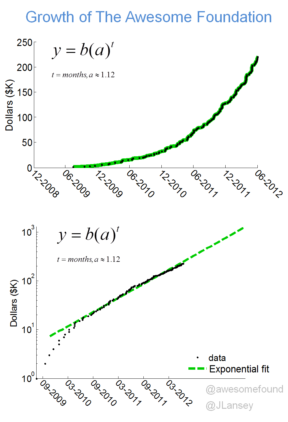
Awesome Chapters
To show the how the number of applications we receive ebbs and flows over time I used a visualization method of Lee Byron call StreamGraph (with the help of a this file by Manu Raghavan). The spike in the purple Canada application pool occurred when the Toronto Chapter was featured in the Toronto Starr Newspaper.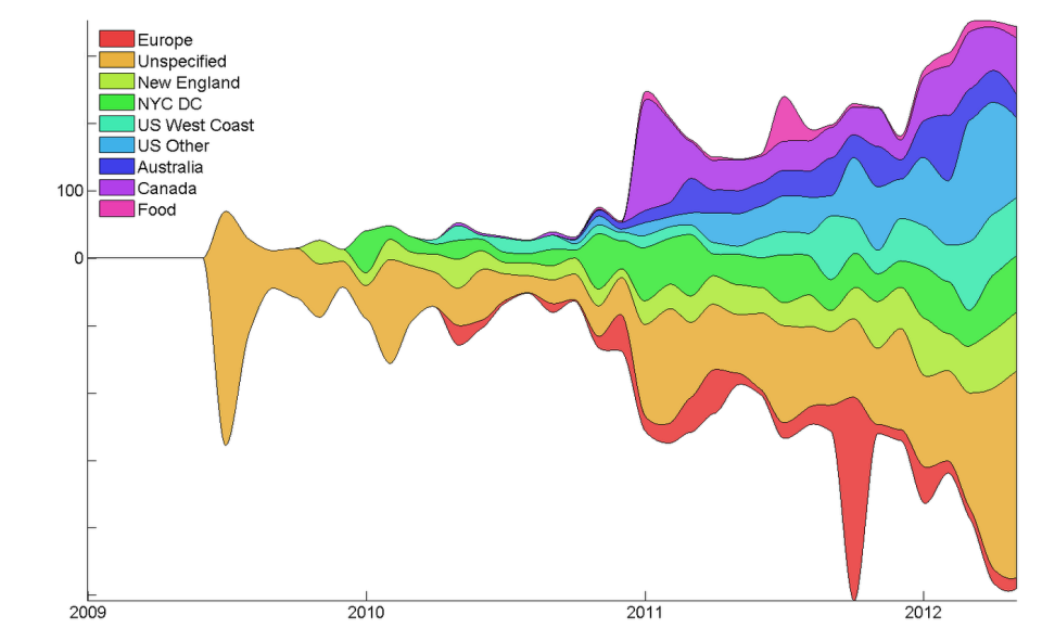
Awesome Topics
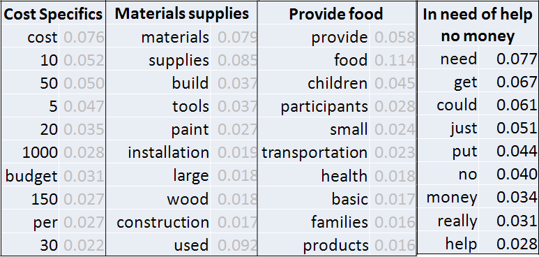
I ran an LDA topic model on all the applications that we received with the help of this Topic Modeling Toobox by Mark Steyvers.Below is the distribution of the topics in the projects that won a grant. The more associated the topic is to a particular grant ... you might say the more awesome it is!
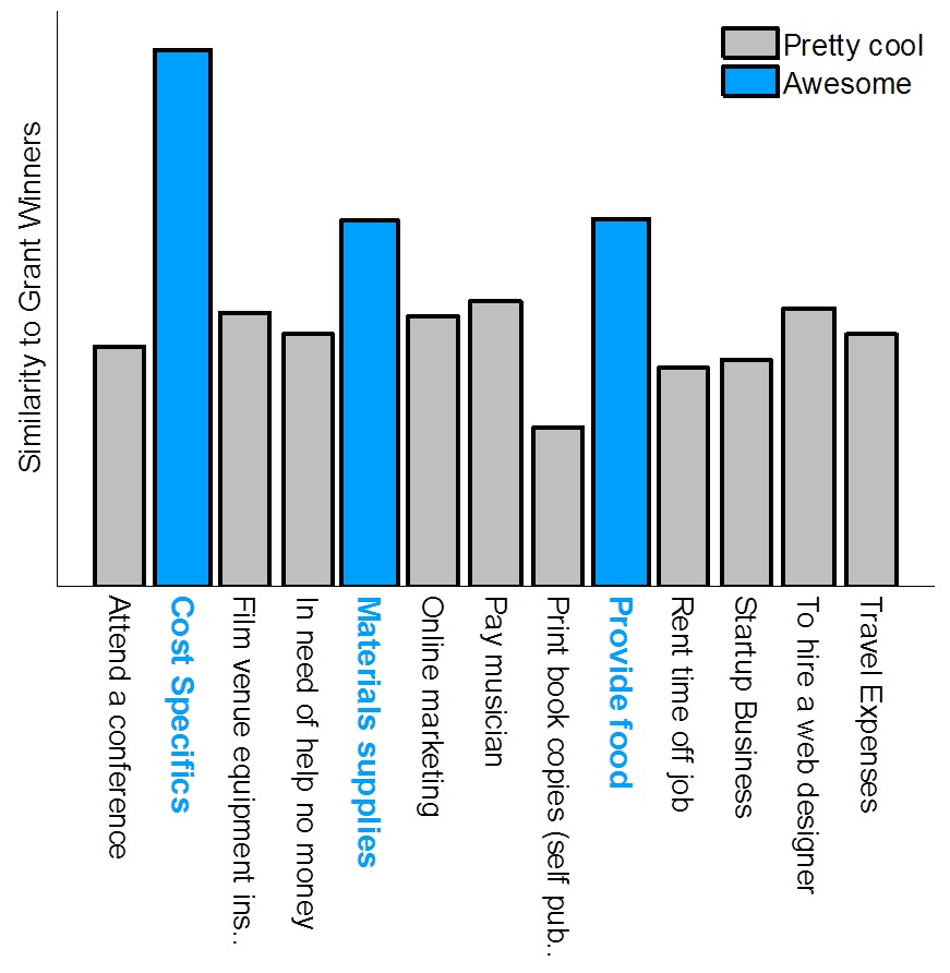
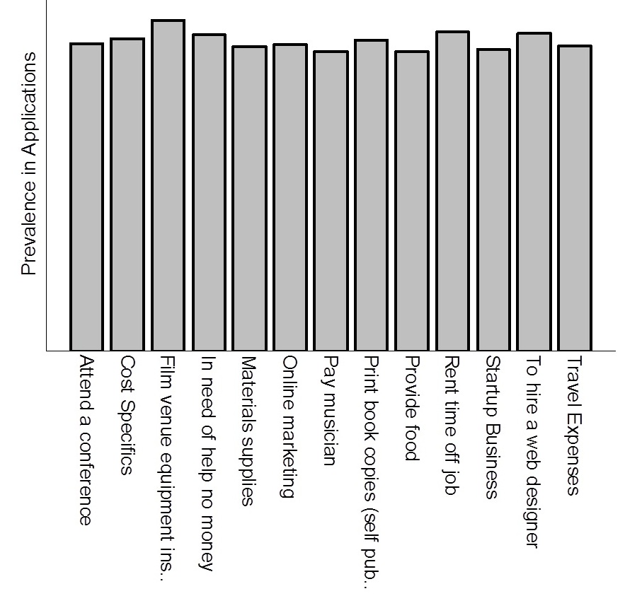
The cost - specifics topic is likely popular because we love it when the grantee shows that they have a specific need and plan for the money, and the best way to communicate both of those is to give us the cost-specifics. As a trustee, I also love granting money to give people food and to buy materials, especially compared with the grants that request money for time off their job. For comparison, below is the relatively even distribution of these topics in all the applications we received.
Your Awesome Project
Do you have an awesome project? Go ahead and apply here! I don't use the topic model to review applications so don't try to game the system - but feel free to email me about your project if you think I'd be interested (I don't always review every application).