Pebble charts: keeping the things inside the numbers
A pile of photographs can show both how many objects a collection contains and what those objects look like. What happens when the pile becomes the chart?
A bar chart of vehicle reports can tell you that one category contains thousands of records while another contains thirteen. It cannot show you what those records look like. A gallery can show you the vehicles, but scrolling through thousands of pictures is a difficult way to understand the totals.
I wanted to keep both views together: the collection and its members, the number and the things being counted. That led to a design I call a pebble chart. Each category becomes a pile of images. The first few images are large enough to recognize; farther up the pile, the images become smaller and the rows hold more of them. Every image still corresponds to one item.
The result borrows the outline of a bar chart and the directness of a picture inventory. It is an experiment in making collections visible at several scales, rather than a claim that every bar chart needs photographs.
From thousands of reports to individual vehicles
The first example uses Bike Bureau reports of vehicles blocking bike lanes. In the snapshot used here, the Cars category contains 3,269 reports; the categories for motorcycles and WB Mason each contain 13. A single uniform image size would create an awkward choice: make every image tiny, or let the largest category extend far beyond the page.
In the pebble version, broad patterns emerge from the pile. Small categories remain visible, and the lower rows retain recognizable vehicles. In the interactive version, individual images also link to their underlying reports, giving a reader a path from the aggregate back to the evidence.
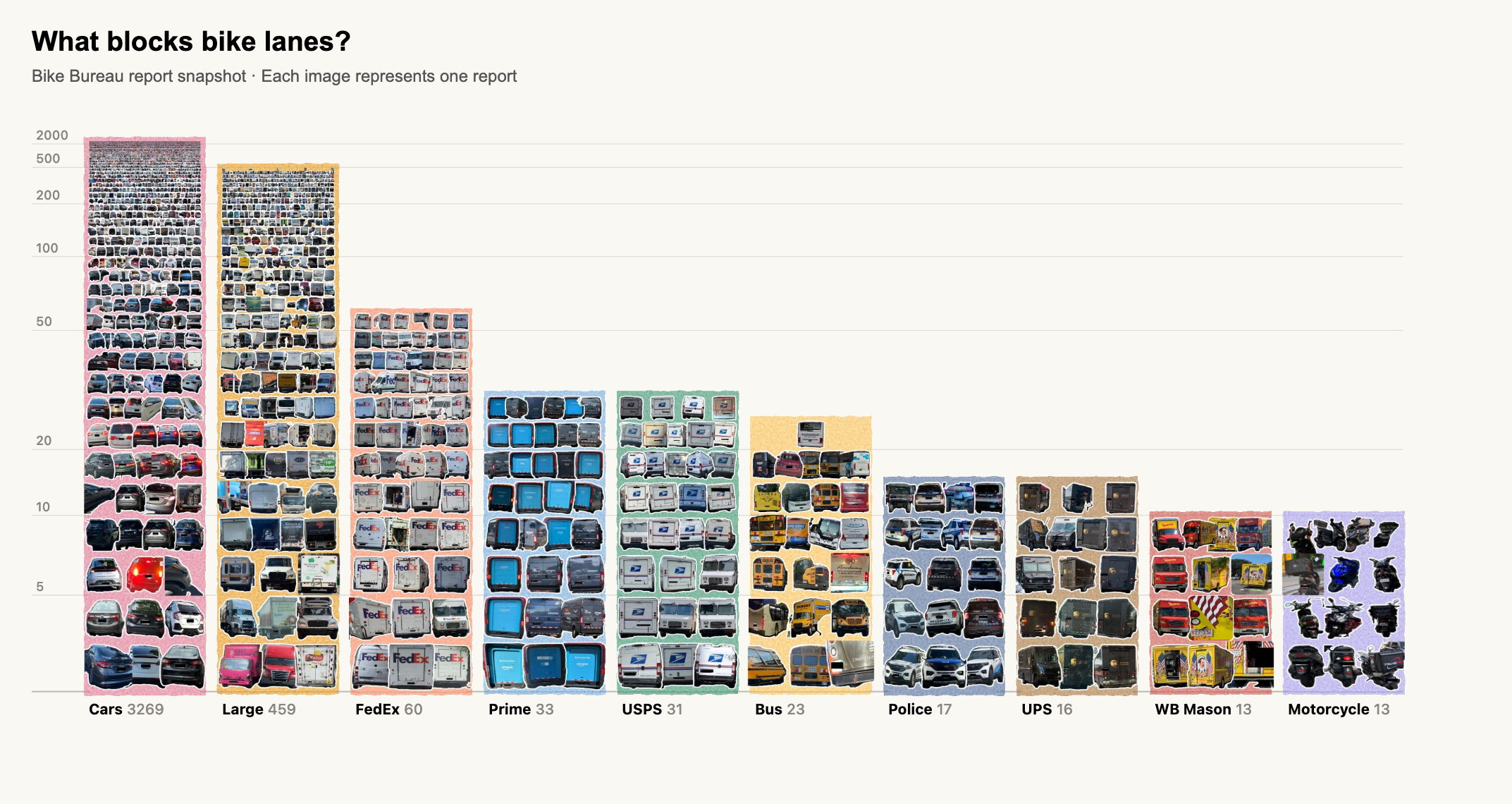
That last distinction matters. These are reports, not a random sample of street activity. Repeated appearances may refer to the same vehicle. The chart makes the contents of the collection more inspectable; it does not remove the collection’s sampling limits.
Nor are all images equally inspectable. The uppermost marks in a large category can become too small to recognize at ordinary screen resolution. Keeping an item in the rendering is different from making it legible. The design offers a transition from recognizable examples to aggregate texture, and readers need the category labels and count scale to interpret that texture.
Why the rows grow by 1.1
The layout starts with a simple rule. Number the rows from zero. Before allowing for the last, partly filled row, row r has room for the integer part of 1.1r images. Each image’s square layout box has width W/1.1r, where W is the unsqueezed column width. Moving up one row therefore reduces the image size by about nine percent while gradually increasing the number of images that fit across.
The attraction of 1.1 is this gradual change. A large multiplier would make neighboring rows jump sharply in size and capacity. A multiplier closer to one would preserve larger images for longer, at the cost of more rows. The current 1.1 setting is a design choice balancing those pressures, not an experimentally established optimum.
There is an important terminology trap here. The implementation calls this parameter log_base, but the displayed height is not an ordinary logarithm of the count. Row heights shrink as the rows become more crowded, and total column height is the sum of those shrinking heights. The count axis must therefore be calculated from the actual packing rule. Labeling the axis simply “log scale” would conceal a consequential difference.
The second choice is where to start. At a base of 1.1, rows zero through seven have one slot each. Rows eight through eleven have two slots each. Together, those twelve rows contain sixteen slots. I reserve those sixteen slots as invisible padding and crop the empty rows from the bottom. The first visible row then has capacity for three images.
No observations are thrown away. The offset skips empty layout slots, not the first sixteen records. It avoids an oversized staircase of single images before the pile begins to look like a pile. A category containing only one or two items would still have a partly filled first row.
The resulting height is nonlinear, and counts that share a partly filled final row can share the same height. A column twice as tall does not represent twice as many objects. Images provide the item-level cue; the axis and numerical labels provide the quantitative reference. These qualifications belong in the explanation of the chart, not in a footnote readers are expected to discover later.
A collection small enough to browse
The same design also works with a more intimate collection: Japanese ceramics from the Freer Gallery of Art at the Smithsonian’s National Museum of Asian Art. Bowls and jars dominate this dataset, but the small categories remain worth looking at. An ewer is not interchangeable with a pitcher just because each category happens to contain three objects.
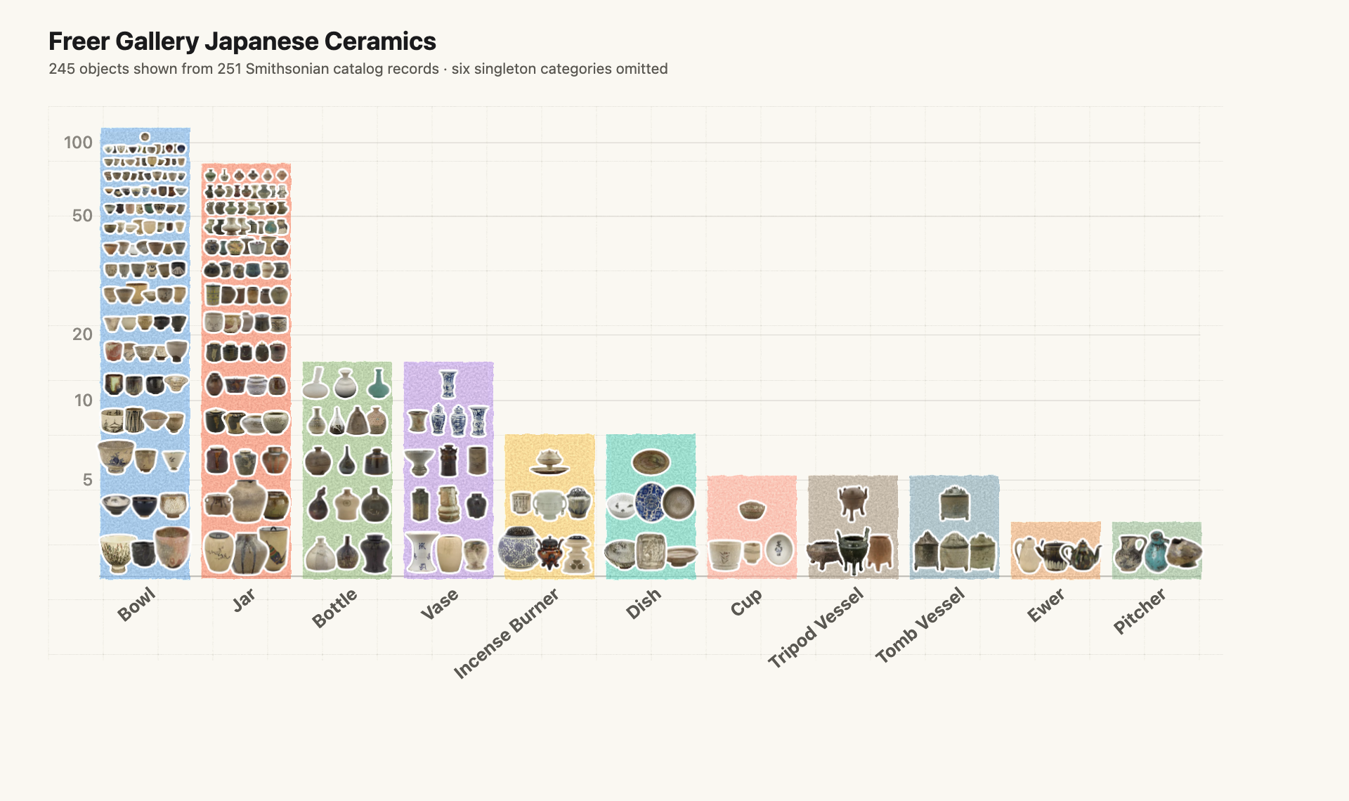
The images carry information that a plain count cannot: differences in shape, surface decoration, color, and silhouette. The interactive chart links objects to their museum records. It becomes possible to notice an object while comparing categories, then follow it into the catalog.
That is a different ambition from estimating an exact ratio as quickly as possible. For a reader who only wants to know how many bowls there are, a labeled bar or a table may be enough. For someone deciding where to begin exploring a collection, examples are part of the information.
The prototype also exposes an editorial choice: its smallest six categories were filtered out. That filter is separate from the sixteen-slot layout offset and should be stated explicitly. A presentation of an entire collection should restore those categories, or make the subset clear in its title and caption.
What if every item is interchangeable?
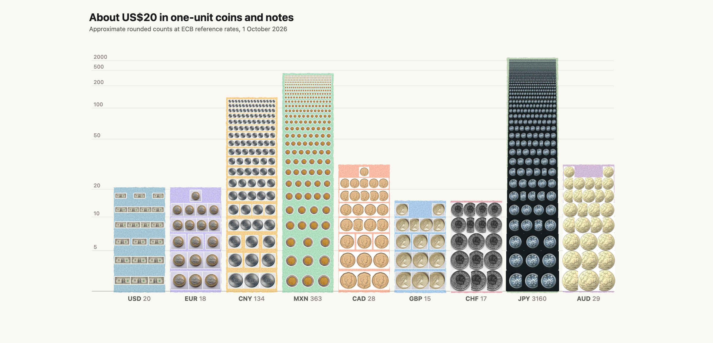
Vehicle reports and museum objects have individual identities. A useful test of the idea is to remove that advantage. Consider how many one-unit coins or notes approximately equal twenty US dollars in different currencies. The US column contains exactly twenty images of a one-dollar bill. Other columns repeat a one-euro coin, a one-pound coin, a one-yuan unit, and so on.
Here, each image represents one unit of its own currency; it does not represent a different photographed object. Repetition supplies a concrete counting unit even when there is no object-level story to explore. The piles can range from a few dozen units to thousands, putting the compression under a different kind of pressure.
| Currency | Converted units | Images shown |
|---|---|---|
| USD | 20.000 | 20 |
| EUR | 17.702 | 18 |
| CNY | 134.091 | 134 |
| MXN | 363.340 | 363 |
| CAD | 28.492 | 28 |
| GBP | 15.113 | 15 |
| CHF | 16.706 | 17 |
| JPY | 3,159.674 | 3,160 |
| AUD | 28.775 | 29 |
For a reproducible snapshot, start with the European Central Bank’s reference rates, all quoted against the euro. Divide each currency’s rate by the US-dollar rate, then multiply by twenty. Round the result to the nearest whole unit for the number of images, while retaining the unrounded value in the accompanying table. This makes the US column exactly twenty; other columns are explicitly approximate.
Alongside the dollar, euro, yuan, peso, Canadian dollar, pound, and Swiss franc, the chart includes the yen and Australian dollar, two other widely traded currencies. Foreign-exchange turnover provides a defensible selection rule for those additions; “market capitalization” is not the measure used here. The date matters, too: these are exchange-rate equivalents at a particular moment, not a statement about local prices or how far twenty dollars will go.
What the pictures might help us remember
The appealing hypothesis is that pictures give readers additional ways to remember a quantity. A category is more than a label and a height: it may also be a brown pile of delivery trucks or a field of patterned bowls. The objects might help establish what is being counted, and the texture might make a large collection feel numerous.
Those possibilities still need testing. A memorable category is not necessarily a memorable count. A striking pile may attract attention while making precise comparison harder. Repeated currency images may offer fewer memory cues than distinct pottery objects. Familiar logos may help some readers and distract others.
A planned study will compare the full image piles with plain columns using the same height function, color and grayscale versions, and conventional logarithmic bars with an ordinary, unshifted count axis. The conventional controls have no skipped layout slots or added count offset. Readers will estimate counts and reconstruct quantities after a short viewing period. Separating the image treatment from the geometry is essential: otherwise, any difference could come from the scale, the color, the pictures, or their combination.
Until those results exist, the strongest claim is a design one. Pebble charts put an overview and its constituent images in the same place. Their usefulness will depend on the collection, the viewing size, and what a reader is trying to do. Sometimes the most interesting question about a category is simply how large it is. Sometimes it is what we have hidden inside that number.